Monday, 28 March 2016

Interactivity + Refinements


Notes from original printed poster: 
  • make mandatory text smaller, logos smaller
  • make image slightly shorter (a bit pixelated up close)
I had an idea to make my poster interactive to the general public, because this makes sense in terms of my theme - pulling things apart and analysing them should be rather a hands on process. In this concept, a viewer would have to rip away the paper where the dotted lines were, thus uncovering the intestines. This reinforces the idea of the theme, dissecting and looking inside (it might make more sense if they had to use a knife and cut it away but that's a bit impractical so I went with ripping). Black and white for the purposes of printing costs. 


Poster end result after paper is ripped. Still works as a poster, even after the "interactive" part has already been completed by somebody.


Some ideas for improvement: 
  • make it more obvious that the viewer has to rip the piece away with their hands? an arrow or some scissors or something pointing them to it? 
  • perhaps unrealistic as a mass produced piece? (since this is an imaginary conference it probably doesn't have to be super realistic)
  • Maybe I could try the same thing but with an X marks the spot where someone has to cut and then pull a hole to reveal the guts, or a dotted line circle, that they could tear out? An "X" would be more in keeping with the dissecting theme rather than just ripping a big piece away


Playing with colour palette. 


Ideas for the cover of brochure, the layering of the orange and blue. Still looks sort of sickly and gross, but also has that particular design aesthetic.


Friday, 25 March 2016

Starting the Brochure

So I am starting to construct my brochure and thinking about how I can extend the "guts" theme in a way that I haven't on the poster yet, to keep developing the theme rather than just doing the same thing across the 4 pieces of media.

Ideas so far:

  • continue on with an "interactive" theme, where the reader has to rip something to get into the brochure, relating to the "getting inside" and hands-on nature of my theme, dissecting the anatomy of design? (also possibly implement this in my poster)

  • introduce some more colour, or try reverse background on some
  • As you flip through the booklet go through skin, muscle, veins, marrow, bone maybe, as if you were actually dissecting something
  • perhaps put some knife/scalpel imagery in there to try out the dissecting metaphor
Some very basic layout/graphics ideas: 


Some ideas for the speakers graphics - their head exploding with the violent knowledge of design (ha, ha.) Makes sense in the context of the brain being the source of their design knowledge rather than their guts? A.N. must insert the quote "go with your gut" because, relevance. 


Some of the speakers texts so far:


Keynote speaker - Kate Moross
Kate Moross is a London graphic designer, creative director, author, illustrator and video director. yada yada, has spoken at many design conferences before, has lots of wisdom about stuff bla bla bla. Her speciality is illustrative typography. Having tried her hand at almost every type of design there is, she knows better than anyone the definition of design because first, to break open something, we gotta know what it is on the outside and know its function. etc. 

Harry A'Court
Harry A’Court is the founder and creative director of Inject Design, an award winning design company based in Wellington, NZ. Harry and his team specialise in projects that allow a high degree of creative expression, and he offers an understanding straight from the industry, on what makes up a piece of design that provides joy and interest than just the designs without heart or feeling or anything. 


Inspiration Pieces

  • very generous with negative space
  • grids grids grids (and lines)
  • compelling photography
  • minimal colour
  • justified paragraphs


Thursday, 17 March 2016

Continuation + Photoshoot

I did a photoshoot with some lamb intestines I bought for the project. Everyone had suggested that the visceral disgustingness of actual real intestines worked better to grab attention than a prettier composition might have done.


Composition experiments


Most recent composition


With this I tried to combine a really clean design aesthetic to contrast with the disgusting close up guts, but I think it looks a bit too clinical and like a doctor's convention or something. Need something to indicate that it's a design conference? More artiness?? Maybe use circles or something

Process, business, clients, message, function, etc etc. What is design. Get speakers who's work I like, who can get inside their design and explain the angle that they started with to make it, explain their brief.??

Mandatory text

The following details need to be on your poster/brochure

Conference speakers include
Presenting 4 internationally acclaimed creative designers/thinkers.
[list your speakers] 

Venue
Massey University
Te Ara Hihiko, The Pit and Gallery E 
Massey University Entrance E
Buckle Street, Wellington, New Zealand

Date
Saturday 24 November, 2016 9:30am to 5:30pm

Tickets
Online registrations are now open at http://creative.massey.ac.nz
or you can register for tickets by calling +64 4 8012794.

Stay Up-to-date
Go to http://creative.massey.ac.nz to ...
...join the [your event title] mailing list.
...join the [your event title] Facebook group.
...follow the [your event title] Twitter group 

Sponsors
This event is made possible with the generous support of ...
–dinz & Massey University logos


Introduction


Inside every successful design, are the parts that fulfil its function. The anatomy. The guts. Things that make design successful include both the tangible and the intangible. All these things are vital in whether it is a viable and successful design… whether its anatomy functions as desired. 


typography
composition
layout

vs

metaphor
connotation
message

the physical vs the mental etc etc. 


Monday, 14 March 2016

Critique

These were the 2 posters I submitted to the class for critique today, representing two approaches: One approach was the "messy, dirty, gross out" approach, shocking the audience with actual images of intestines, and the other approach I took was more "design-y", clean and aesthetically pleasing, but just hinting at the guts, rather than being very overt and showing it directly.


This was the critique submitted by the class:


Critique for "gross" concept:

nice word play - guts, dissecting, carries theme through
you could try writing the word guts with the guts texture?
uncomfortable to look at but thats what is engaging, more effective than the other one at being engaging
dont over use the hand drawn script! still need a focal point but good starting point for shock value.
simplify information text font
more hierarchy with text
strongest of the two. Create the text and photograph it using the meat juice
very eye catching and gruesome
too much loose type that is confusing to the eye with the similar blood and guts
the use of imagery made concept more convincing with the title
strongest of the two. love the use of flow and movement with composition. gut imagery very confronting and intriguing

Critique for "design" concept:

disturbing but engaging imagery great play on words.
not clear what image shows. perhaps cutline through the "s" should extend to other letters
image not clear, blood stain? show more grit
more visually appealing; nice use of negative space
if the idea is guts, make the image a bit more messy, be authentic, dont be "tamed"
good balance between controlled type and raw imagery
nice design style, good tagline size, dont make it too small
maybe make splotch darker and closer to blood colour?
try creating gut type, red bit could be blood splatter.

Where to go from here:

In people viewing this media, I really want to strike a good balance with the disgust of entrails, and the aesthetic beauty of my layout, because the perfect contrast between the two will be very striking and engaging.

Sunday, 13 March 2016

Concept Refinement


This one was exploring the idea of cutting or tearing open, which is the latin meaning of "anatomy", and then the "guts" bleeding out of the actual literal design, its physical material paper. 

Cutting open of an ampersand, like it was about to have its anatomy studied. Fairly basic concept, cutting open and examining design.  


More visual layers of meaning especially referencing the cutting open and the anatomy. Separation of the typography for "guts", reference the sectioning something would undergo to have its anatomy studied. 
Dynamic and violent streak of blood, provides texture, excitement, movement to the clean typography and logotype. Cut open "s" referencing the word "anatomy" again. Juxtaposition of clean, scientific studying, and messy blood swipe, the messy process underneath that leads to the clean end result. Image of intestines superimposed over the blood sweep, not sure if needed?
Perhaps a bit heavy handed with SOOOoo many references to "cutting" 

Saturday, 12 March 2016

Pinterest Board

https://www.pinterest.com/squelzy/guts/


Stefan Sagmeister (gross-out approach. Confronting, visceral, etc etc)


Referencing medical textbooks, scientific looking, clean, less disgusting.


Monday, 7 March 2016

Speakers + Theme Refinement


Questions to ask about my theme:
  • What do I mean by "anatomy"?
  • Are there other meanings within my design, for example passion and vigour?
  • Make sure to pay attention to the distinction between art and design with my speakers 
  • Practice vs differentiation? 
5 speakers - 1x keynote speaker, 4x normal speakers

Speakers


Keynote Speaker Kate Moross - London designer, art director etc. Offers international perspective and has spoken at many conferences before.


Harry A'Court - creative director/designer at Inject. Offers industry perspective.


Kate Cullinane - Author and graphic designer, Auckland. Offers industry perspective.


Shane Cotton - NZ Artist. Offers fine arts perspective.


Tony Seddon - Author of many typographic and design books. Offers theoretical perspective.

Theme Direction

Focusing on:

  • the anatomy of design, the physical makeup of a good piece of design - its typography, layout, hierarchy, etc.
  • offering both industry perspectives, and theoretical perspectives. 
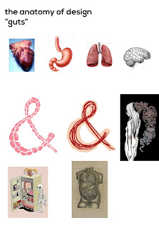
  • Think about: the semantics of my visual metaphor - "getting inside a good piece of design" "inside perspective" "cutting something open" "if my conference is called "guts" should literally use "guts" and maybe not vital organs?
  • If I was to use organs, perhaps put something in title about how each design practice or tenet is very important, vital, like an organ? 

Theme + Compositional Practice


At the moment I am quite attached to this visual metaphor of anatomy and guts, which I think represents quite well the "interior", the "inside" of any concept (including design), but this requires I refine the concept of my conference to avoid confusion with the word "anatomy", and confusion as to whether I am talking about art and design as different, or whether I am talking about their practices crossing over.

I could focus on:

  • The construction of a good piece of design, and the practices it might have borrowed from fine art (looking "inside" it so I can still use that visual metaphor of guts and anatomy) or:
  • Abandon these visuals, in favour of focusing my conference on the "definition" of design, and whether it is the same or different to "Art", or neither.